Saturday, May 31, 2014

Modifiers: How to Know if You Need Them

Post by Elisabeth TenBrink Kelley, co-founder

     I have been told over and over again how modifiers, particularly adverbs, are bad. I've also read over and over again, books that use them that are great. So, how is that possible? To be clear, the books I'm talking about are not just good in my opinion. I'm talking about Lord of the Rings, The Chronicles of Narnia, Harry Potter, Eragon. And these fantastic works use modifiers, and use them well. That's the real question, how can you use a modifier well? Obviously, like other parts of description, it is largely an individual author's taste, but there are certain guidelines that apply to description that apply here too.
  • Be clear: Do not use modifiers that confuse what you are saying, but use ones that make the bare nouns and verbs better understood.
  • Be concise: Do not use modifiers simply to use them and, just as you should strive to eliminate modifiers by finding better nouns and verbs, try to eliminate a string of modifiers with fewer, stronger ones.
  • Be vivid: Evoke strong images in the readers head using strong nouns, verbs, adjectives, adverbs, and the occasional simile or metaphor.
     In order to find if a modifier is important to the description or not, I have found this method to be useful:

     Remove the modifier in question and read the passage. Put the modifier back, and read it again. Has the meaning or the image changed? If not, the modifier is unnecessary, and should be removed. Sometimes, it works better to do this with a friend (which is why you should give them the modifier-free version first) as they will not know the image you are trying to convey, only the one you have conveyed. Here are some examples to show what I mean.

"Jason, what are you doing?" she shouted.

"Jason, what are you doing?" she shouted angrily.

     Does the image really change between these two? I'm guessing no, as we usually associate shouting with anger. However, if I had instead put "horrified", there would have been some change, unless some previous description, or knowledge of what Jason was doing, had told us already that what he was doing would be horrifying to her. Now, I use the word "told", but something implied works just as well. For example:

Jason picked up the sacred stone and glanced defiantly at Cecilia.

"Jason, what are you doing?" she shouted.

     Here you can see how the word "horrified" became unnecessary, but also how other modifiers were important. For example, "sacred". Without that, the entire passage becomes meaningless. Why would Cecilia care if he picked up a rock? Also, "defiantly". It tells us his attitude. If I had just put "glanced", he could be thinking any number of things. He could be looking to her for approval, guidance, maybe picking it up is a joke. But no, he glanced at her defiantly, showing that he knew that she did not want him to do it, but he did it anyway.
     So that is the way I determine whether or not to keep or toss a modifier. Modifiers can enrich you work, or they can bog it down. It all depends on how you use them, like any part of writing. Do you have a particular method that you use?

Elisabeth TenBrink Kelley is an aspiring author and poet. To learn more about her, see our About Us page. You can follow her on Twitter here: @ElisabethGTK.

We have one contest currently open to submissions, and art contest. If you're interested, click here.

Saturday, May 24, 2014

How to Key a Background in Photoshop

Post by Elisabeth TenBrink Kelley, co-founder

     Something often used in film is "keying" a color. This is what they do with green screen. They make the background one color, and then key that color, and remove it, leaving it clear, which allows them to insert something else. Now, it can also be useful to photographers and graphic designers, as it was to me just yesterday, so I'll explain how to do it. Now, I use CS5, but certain earlier versions do work, and later ones certainly do, but I'm not certain which ones.

     So, the first thing is to have a picture with a distinct background. It doesn't have to be perfectly one color, but the closer the better. Here's my example:


     Seeing as this is a computer-made image, the background is very distinct, but with photos it will likely not be, so try to fix that as much as you can. Before we can move on, you need to make use that your primary color is the same as the background, so get the "eyedropper" tool and click your background. It looks like this:


     Next, we go to "Select" in the tool bar and click "Color Range", which is highlighted in blue below.


     Once you do, you will see a window like the one below, which will show you what is selected. (The white is selected, not the black) Adjust the "Fuzziness" until it covers the background well, but not the subject. You can also choose other preview options, which change the appearance of your image, not the black and white preview in the window.


     Once everything you want to get rid of is selected, press "OK" and you will be left with this:


     However, before you can remove the background, you need to make sure that your layer isn't locked. Background images are by default locked, and if you only have one layer, then it is automatically a background. It see if your layer is locked, look for the little padlock next to it.


     If it has one, just click and drag it to the little garbage can at the bottom of the "Layers" window. With that done, make sure everything you need is selected, and press "Delete".


     You should be left with something like this; a clean image ready to receive a new background. There are other ways of removing backgrounds, but this is the quickest and simplest, as long as you don't have anything of the background's color in the subject. If you do, the "Lasso" tool would probably work better.

Elisabeth TenBrink Kelley is an aspiring author and poet who likes to tinker with things in Photoshop. You can learn more about her in our About Us page.

Saturday, May 17, 2014

How to Write an Italian Sonnet

Post by Elisabeth TenBrink Kelley, co-founder

     There are essentially two types of sonnets, the Italian sonnet, also known as the Petrarchan sonnet, and the English sonnet, also known as the Shakespearian sonnet. Today I will be covering the Italian sonnet, and I'll cover the English sonnet later.

     Italian sonnets, and any sonnet written in English for that matter, generally have iambic pentameter. What on earth does that mean?
     Well, to start, meter is the rhythm of a poem, and there are different ways of measuring that. Iambic means that you deal with syllables (rhythm is based in syllables) in pairs, the first syllable being unaccented and the second being accented. This means that more emphasis is being given to the second, fourth, sixth, etc. word of that line as compared to the first, third, etc.
     The whole emphasis part is rather hard to notice or cause while writing it, but it becomes important when you consider the word "pentameter", which has the same root as "pentagon". That means that you will have five such pairs per line. So, basically, you need ten syllables per line.
     Next, is the rhyme scheme. The Italian sonnet is made of two sections, or stanzas, the first having a ABBAABBA rhyme, which would be something like this:

I saw a bird upon the bough of a tree
His breast was red but his great wings were blue
His bright colors reminded me of you
I wish you could be here with me to see
This bird who reminds me of you and me
Because you know that our love was forever true
And this dear bird brings forth my pain anew
Wings your eyes and breast as your hair should be

     So, for every "A" in ABBAABBA, I have a line ending in the long "e" sound, and for every "B" I have something ending in the long "oo" sound. This is a quick love sonnet (well, the first stanza of it) that I whipped up for this, so as I have never been in love and I did this in minutes, it isn't as good as it ought to be. I added random adjectives like "great" to meet the syllable requirements, which isn't something you should do, but it will work as an illustration.
     The next stanza is more flexible. While it still should be in iambic pentameter, there are several rhyme scheme's you can use: CDCDCD, CDDCDC, CDECDE, CDECED, and CDCEDC. I'll give another example by completing the poem:

Ah, my dear, I shall never love again
If I can't have your blue eyes and red hair
Then I choose nothing, but to bear my pain
Alone and waiting for death to take me
To heaven, for I know that you are there
And have been, since the day that you were slain

     Here I used the last rhyme scheme, CDCEDC, with the "C"s being "ain", the "D"s being "air", and the "E" being "me". I hope this has helped you, and I'd love to see your Italian sonnets, in the comments or in future contests! Keep writing poems, keep trying new things, and keep hoping!

Elisabeth TenBrink Kelley is an aspiring author and poet. To learn more about her, see our About Us page. You can follow her on Twitter here: @ElisabethGTK.

Saturday, May 10, 2014

How to draw a female manga body

Hey everybody, Catsi here. Again. I'm doing another art post (yay!), this time on drawing body proportions.

I won't spend forever rambling about art before we get into the tutorial this time. All I have to say is that this is just my way of drawing bodies. There are tons of other ways--just google it. Try different styles, and find out what works for you.

So here we go.
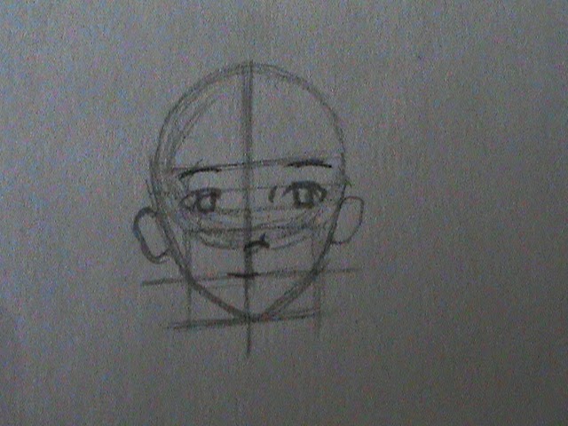
 Step one: Draw the head.
If you missed my last tutorial on drawing faces, here's a link: http://windowtothesoulcontests.blogspot.com/2014/03/how-draw-manga-face.html
 Step two: Add circles for the body.
A smaller one for the upper torso, and a larger one for the hips.
 Step three: Circles for legs and arms.
I only drew one circle for each arm, since the pose I'm drawing will have the character with her hands behind her back.
 Not a step: Proportions
I just drew a few brackets to give you an idea of how everything is proportioned, using the head as a comparison. Each bracket is one head long.
 Step four: Out line the torso and arms.
Take your time, and make sure that everything looks like the way it should be. 
 Step five: Outline the legs.
Again, take your time. Try to make the legs look symmetrical.
 Step six: Feet.
I have the toes pointing toward each other in this picture, but feel free to experiment and do them however you like.
 Step seven: Add clothing.
This may look like a complicated step, but it's not too hard. Just have fun and draw her clothes in your favorite style. A few wrinkles here and there will add a bit of realism to the drawing.
 Step eight: Outline the hair.
I've chosen to give my character sideswept bangs and a single braid over her shoulder. It's just the rough outline at this point--I'll make it more detailed later on.
 Bonus tutorial: Braids, step one
I erased all the lines under the braid, just so I can see to work.
 Bonus tutorial: Braids, step two
Don't try to make the exact shapes that I have drawn--they're not supposed to be perfect. Just make a few heart-ish-diamond-ish shapes, getting smaller as you go down the braid. A little ponytail on the end finishes up the outline.
 Bonus tutorial: Braids, step three
Add a few lines for the strand of hair every here and there, making sure they're going in the right direction for the braid. Voila! Done.
 Step nine: Darken your lines.
Make sure not to darken the guidelines your drew early on--you want to be able to erase those in the next step.
 Step eight: Erase guidelines.
If you drew your guidelines lightly enough, and your outlines dark enough, you'll be able to erase the guidelines easily and not have to stress over accidentally erasing a line that you want to keep. Even if you do erase one, it'll be dark enough that the mark will still be on the paper, and you can go back over it.
 Step nine: Finishing touches!
Sign, date, and add extra lines in the hair and clothing. Ta-da! You're all done.

A few quick tips for you:

In this tutorial, I had my character's feet pointing toward each other. I think that makes her look cute, and conveys an air of innocence. 
If you so choose, you can spread the legs farther apart, making your character seem more determined.

I've also got a nice little reference sheet of different poses for you. Move around an arm or leg by changing to location of a circle, and make an entirely new pose!
(I've left the guidelines unerased, so you can see the circles underneath the clothing.)

Well, I guess that's it. Hope you all had fun! If you have any questions, just post in the comments.
Also, I'd love to see how your drawing turned out! Feel free to email it to us, at windowtothesoulcontests[at]gmail.com, or if you posted it on your blog, drop us a link in the comments.

We have an art contest going on right now. You can view the guidelines here: http://windowtothesoulcontests.blogspot.com/2014/05/mother-art-contest.html


Saturday, May 3, 2014

Good Writers Drop Nukes--Guest post by Logan Judy

Guest post by Logan Judy

Good Writers Drop Nukes
I’ve long been obsessed with what makes a writer a great writer.  My interests in fiction are very diverse, stretching from massive classics like Les Miserables and Dante’s Divine Comedy to modern works like the Percy Jackson series and Neal Shusterman’s Unwind Dystology.  I’ve also read some books I despised.  So I kept asking, what separates these guys from the rest of the crowd?
There are many things that separate them, but I’ll tell you one that is very important, and fairly easy to grasp: Good writers drop unexpected, fat, whopping, H-bombs on their readers.  
Recently I was talking with a friend who is currently reading my novel Finding Sage.  He was referring to an event that happens about half-way through the book, and told me “At that point, I knew that everyone except for Silas (the main protagonist) was fair game.”  
That wasn’t intentional.  When I wrote that into the plot, I hadn’t sat down and decided I was going to make my story unpredictable by that plot element, but the effect was still there.  I had stumbled onto a gold mine.  Now I use that as a hard and fast rule for every novel.  Drop nukes.
Take for example J.K. Rowling (if you haven’t read the Harry Potter books, this is a huge spoiler, so you might want to skip this paragraph).  When I picked up Harry Potter and the Deathly Hallows (which just happens to be my favorite in the series), I had no idea what was going to happen to Harry.  For all I knew, he could live, he could die, or he could become possessed by dark magic and turn evil before killing himself.  I had no idea.  Why?  Dumbledore.  Most fans may never have said it aloud, but Harry Potter fans assumed that Dumbledore was off limits.  She’d never kill him, right?  He’s the supreme leader!  The guy’s practically a god!  There’s no way he could die!  Then she killed him.  That was a nuke if there ever was one.  The result?  We all had no idea what to expect.
That’s the power of dropping a nuke.  Every reader starts a story with the assumption that all of the main protagonists will live and the villains will all die or be permanently subdued in some fashion.  When you tear that assumption to shreds, you set a precedent.  By killing an important character, for example, the reader is never sure that any of his or her favorite characters are safe, even if you don’t kill a single character for the rest of the series!  A good guy is shown to be a traitor, and all of a sudden every suspicion on the part of that paranoid worry wart is legitimized.  
There can be good books without nukes.  I’ll give you that.  But the ones we remember are the ones with nukes.  That’s why we remember the sixth Harry Potter book so well.  That’s why Christopher Nolan fans love The Prestige so much.  That’s why Star Wars is such a classic.  And that’s why so many predictable books get lost in the shuffle.
Good writers drop nukes.  So go into your writing spot and pull out your plot chemistry set.  For me that’s a crowded desk in a tiny excuse for a room that used to be a breakfast nook.  For you that might be the upstairs bedroom.  Or your parents’ basement.  Or that table at Starbucks that might as well have your name written on it.  Whatever it is, go there, and get to work.  
I look forward to the mushroom clouds.

You can connect with Logan Judy, the author of this post, through his Facebook:
https://www.facebook.com/loganjudyauthor
Or, his Twitter:
https://www.twitter.com/loganrjudy

Thursday, May 1, 2014

Mother Art Contest

Deadline extended to June 25th!

     As you can see from the title, this will be an art contest, about mothers. During May. How fitting. You can use any art style you like, but the subject must show something having to do with mothers. It doesn't have to be an actual mother, or even female, but some quality of motherhood must be included. Catsi and I will be judging, and we will be judging based on the look of the drawing, but more so, emotion. If the chibi drawing evokes more emotion than the gorgeous painting, the chibi drawing will win. (And lets face it, mothers are almost always accompanied by babies, and chibi drawings make great babies.)

     The prize is publicity. We will tweet the winner's links and (with their permission) image, as well as post them on Facebook. Well, here are the guidelines:

"Mother Art Contest" or some variation of that should be in the subject line. Basically, just be sure that it is obvious which contest you are submitting to.

You may include a short bio, no more than 150 words.

You may include links to your blog, Facebook page, Twitter profile, website, etc. These can either be in your bio or after it.

Your name or pseudonym should be in your bio or, if you do not have a bio, in the body of the email.

If you sign your works you should provide two versions, the original and one with your name blurred out.

If you do not want us to display your image, mention it in your submission email. Otherwise, we will show it on our website, in our newsletter, and possibly on Facebook and Twitter. If you would like it to be posted on our website and newsletter but not Facebook and Twitter, mention it in your email and we will respect your wishes. This does not disqualify you, nor will it affect your chances of winning.

Your submission should be in GIF, PNG, JPEG or PSD format. 3D art is accepted and encouraged, but it must be a flattened image in one of the above formats.

Your submission should not contain any nudity. This website is intended for adults and teenagers, and is, in fact, run by teenagers, so we would appreciate that you respect that.

All rights remain with the creator.

We assume that you have all rights, or permission from the other creators, and that you were an integral part of the creation of your submitted work. If there are multiple creators you may have multiple bios and connected links.

You may send in up to three images, preferably in one email. Previous and simultaneous submissions are welcome.

Send all submissions before midnight on June 22nd.

Send your submissions and any questions (which we are happy to answer) to windowtothesoulcontests[at]gmail.com


We have one other contest currently running, this one is prose, in fact it's a prose contest. If you're interested, click here.

Haiku Contest Winner

     I am proud to announce the winning poem of our haiku contest!


The grey morning fog
Rakes its fingers on the ground
Trying to hold on


     Some of you may recognize this as the poem posted in the comments on my "How to Write a Haiku" post, and indeed, it is. Congratulations to our winner, Rosemary Mucklestone. Rosey is a historical fiction and sci-fi writer, and you can find her prose works here.
     Everyone congratulate our winner! Good luck for next time, everyone! Our next contest is an art one, the theme being "Mothers", and we have a prose one going on right now (you can find that one here). If you're really more of a poet, sign up for our newsletter, it's up on the right here, and we'll email you June first with a new poetry contest.