Showing posts with label guest post. Show all posts

Saturday, November 1, 2014

How Do I know If My Idea Is Good Enough?

Guest post by Emily Tjaden

     Sometimes writing is easy. Sometimes it feels like swimming in a bay, surrounded by a tropical paradise. You can breathe a long sigh of stress-releasing contentment. Other times, writing is like climbing a mountain, lugging a fifty-pound backpack and gasping for every breath. Or, worse yet, dangling off a cliff by your pinky finger. All the time, the life of a novelist is a rollercoaster.

     I’ve recently been climbing the mountain. Actually, to be perfectly honest, I fell off the cliff and had to have someone pull me back up. Around 90% of the rollercoaster ride is a result of the internal war that we authors have with ourselves over whether or not what we’re writing about is “good enough.” We’re worried about people rejecting our stories. Naturally, we want to be accepted, but too often, the fear and insecurity caused by the possibility of rejection makes us slow down writing—or worse, stop.

     But how do you know if your ideas are worth writing? Let’s take a look at a few things that every good story has.

• Unique characters
• An exciting plot
• A compelling theme
• Enjoyable prose

     Four things. They aren’t complicated, but often, we make them so. We agonize over the details, and constantly compare ourselves to others. Maybe you just finished a novel in which the protagonist was a brilliant undercover agent who also happened to be hiding a deadly secret, that, if exposed, could cost him his career, and his life. And maybe the protagonist in your story is a farm boy who has been kidnapped and sold into slavery, and has to find a way to regain his former life. Each of these characters is beautifully unique, but the temptation is to compare your protagonist to someone else’s. To think he’s not good enough because someone else wrote something different. The same is true for plot, theme, prose; everything. Just because it’s different doesn’t mean your idea isn’t worth writing.

     Now let’s look at a few things that good stories are not.

• Boring to the writer
• Told out of obligation
• A copycat of someone else’s

     As long as your story interests you, it’s worth writing. If you’re writing out of obligation to create something others will like, it’s probably not going to work. If it does, it will be hard, and possibly fruitless. Certainly not enjoyable, to say the least. And stories that are enjoyable to read are the ones that were enjoyable for the author to write.

     One of the biggest pitfalls for writers is the idea that someone else writes better than you do, when in reality, they simply write differently. You have your style and they have theirs. Trying to mimic another author’s prose does not make a good story. It makes a shadow. And who wants a shadow when you can have the real thing?

     Of course, I’m not saying this means you should never change your style. It’s certainly not wrong to desire improvement. For those of you who seek a career in writing, you should always be looking to improve your craft. But improvement doesn’t mean copying someone else. It means developing your own style.

     This is the part where doubts start to creep in. Things like, “What if people don’t like my style?” or “What if it looks like I’m copying someone else, but I’m really not?” Some people’s styles are similar, and it’s okay. All I’m saying is don’t try to make yourself into something you’re not.

     However, I think that one of the biggest doubt-evoking phrases is, “But I’m just a young writer.” The idea that somehow, age is relevant to whether or not you are capable or generating good plots and writing good prose.

     It’s not.

     I’ve seen many people under the age of twenty come up with spectacular ideas and write gorgeous prose. And they all write differently. Don’t let yourself fall into the trap of, “My ideas won’t be appreciated because I’m too young.” Writing well takes practice, and it’s true that expertise comes with experience. But don’t write yourself off because maybe you haven’t had as much as some people. Remember what I said about improving? While you’re still improving, so are they. I’ll bet you that Tolkien was still hoping to improve after he finished The Lord of the Rings. Don’t think of yourself as a “young writer.” Instead, just think of yourself as a writer, always going up.

     So how do you tell if your ideas are good enough? Ask yourself these questions:

1. Are you excited by it?
2. Are you writing for yourself rather than someone else?
3. Do you think you can use it to help improve your craft as a writer?
4. Is this a story you would love to read?

     If the answer is yes, then write your story. You never know who might love it.


Bio:

Emily Tjaden is a novelist, editor, and blogger. At nineteen, she is the oldest of five, and a Lord of the Rings fan who likes hobbits, dragons, and coffee. Aside from writing weird, speculative fiction, her passions include music, photography, and helping others see the potential they have to make a difference. She can be found blogging about various creative imaginings at www.dreaminghobbit.com.


Also, we have two contests currently open. One is for poetry, prose, and art, which you can find here. The other one is a holiday themed contest for poetry, which you can find here.

Saturday, October 11, 2014

Guest Post: Negative Shading

Guest post by Alexandra S. Grey (P. H. Alexandra)

     Have you ever done a drawing where you felt that you needed to fill in all the space with shading of some sort?

     It might surprise you when I tell you that you don’t have to do that. In fact, it’s sometimes good if you don’t. Leaving white places can illustrate the spots that the light is hitting most, which in turn gives your drawing more shape.

      I call this negative shading. Your piece of paper is all negative space. Leaving some of the ‘negative space’ with nothing in it and shading the rest helps the shading to look shadier! Think of it as white next to black vs. grey next to black. Black looks much darker next to white, even if the same shade of black is placed next to grey.

Posted Image

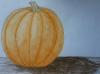
      Have a look at this pumpkin I drew. (Really gets you into autumn mood, doesn’t it?) See how I left a little bit towards the top only very lightly colored? And that’s the most 3D part of the drawing. To leave those spots clear and decide where the shadow should be, you have to decide where to put the imaginary light source. I chose the top left area for the light source.

Posted Image

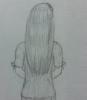
     Here’s a girl I drew, focusing mostly on the hair. I wanted to give the hair a glossy effect, and to accomplish that I left a few areas blank. These lighter areas are darker than what is around them, giving the impression that they are bright spots on something dark, rather than simply undrawn space.

     Have you ever taken a picture and seen that some of the spots were washed out because they were in such intense light? Look at something shiny, or almost anything near you. Which places are lightest? Probably the ones being hit most directly by the light. That’s the sort of thing you want to be aware of while drawing. Think about whatever you’re drawing and where the light source is, the shape of your object, and where it would be logical for the light to hit. Hold back from shading certain places. Experiment. Pencils have erasers because everyone messes up, so do not be afraid to erase or make mistakes.
      Next time you sit down and pick up your pencil to draw, remember these steps for (not)shading:
1. Decide where the light source is.
2. Figure out how the light is landing on your object.
3. Leave the places in the most direct light either white or extremely lightly shaded.

      Now go draw something! I’m sure Catsi and Elisabeth would LOVE it if you posted your work using this technique! :D

~Alexandra S. Grey (P. H. Alexandra)
http://cloudywithach...ouquetsofbooks/


We have a poetry, prose, and art contest with the theme "autumn" currently open. See details here.

Saturday, February 1, 2014

How to draw a chibi, with Josephine Paige

Guest post by Josephine Paige

Hi everyone!
My name is Josephine Paige--Most people call me Josie--and I’m invading the blog with a guest post. I’ve actually never guest posted for anyone before, so this is quite a new experience. Bear with me--I’m here to talk about drawing.
I’ve been drawing for as long as I can remember. (It’s more than a hobby, actually, it’s a bit of an obsession.) I’ve always loved dabbling in different styles and mediums, I love taking lessons when I can--Art is one of my passions. It was about two years ago that I discovered Manga--Japanese cartoons, and since then I’ve been doodling people and Chibis all over my math books. This post is leading up to a chibi tutorial, but before I begin, I’d like to say a few things.
First off: What exactly is a chibi? A chibi is basically a wildly disproportionate mini-person, with big heads and little bodies. (A lot of people I know refer to them as “Josie’s big-headed little people.”) They can be drawn many, many ways, but I’m only going to be going over one of them. So keep this in mind while you’re reading this: This is not the only way. This is just the way I happen to draw them. The way you might do it is not wrong. It’s art. Everyone draws differently.
Secondly: I am not a professional. As I said, I started Manga two years ago. This is also my first tutorial. So please don’t lynch me for offering this; it’s all I have to offer at the moment, and I’m just trying, however successfully, to be helpful. Also, this isn’t a tutorial for coloring or shading or anything--It’s simply focused on drawing the basic thing.
And on that confident note... Shall we begin?


Step One
I usually start with three circles--An abnormally large one for the head, a much smaller one a little beneath, and the third, a bit bigger than the second, at the bottom. Don’t stress if they aren’t perfect circles--You can fix them up later. The two little circles will make the chibi’s bean body--Abdomen. Leave a tiny space between the top two circles for the neck.


Step Two
Here we’re connecting the baby circles and forming the bean. Recently, I’ve been making my chibis kind of fat, or at least on the chubby side. Because of their weird proportions, this only seems to make them cuter. However, if you want a leaner chibi, simply connect the circles in a skinnier way.
Next, draw a line down the middle of the chibi’s head. If you’re using a pencil, and not a computer program, do this very, very lightly. You’ll be erasing it later.
After you’ve drawn the vertical line, lightly add a horizontal one, slightly below the middle of the head. These lines are to help position the features of the face.


Step Three

I’m trying not to do that annoying thing that most tutorials do, where they draw three or four circles and then get really complicated, really fast. That being said, what I’m doing here is a bit weird looking, but pretty easy.
Between the head and the bean, draw a tiny circle. In a few moments, this will become the neck. On either side of the bean, add two more tiny circles. These are basically shoulder joints--Where the arms will be coming off of.
What’s next is pretty much two curvy lines--Curving off the neck and the shoulders. (This is why pencils have erasers, folks--You don’t need to get it right the first time.) Since I don’t really know how to describe it, take a look at the picture above.
After you’ve finished indicating the neck, you’re going to, very lightly, draw two more circles at the bottom of your bean. These are the places where the legs will shortly be sprouting from. (Again, the picture is above and I have no idea how to explain it.)


Step Four

Don’t freak out. Yes, I did just do the legs and arms at once. I probably should have separated them into two steps. The thing about chibi legs and arms is that they’re usually creepily thin, and have incredibly simplified feet and hands. They’re not too bad, you just need a little patience.
If you’re having trouble, draw little mini circles where you want the knees and feet to go, and simply connect the dots like you did with the bean. Ditto with the arms. Remember, fat is cute, so if you “mess up,” it’s not a problem.
I make my chibi’s legs a little longer than most people do, so feel free to shorten them a bit if I’m cramping your style.


Step Five

I’ve kind of zoomed in on my misshapen head here, because I needed a close up to do the eyes. Eyes are some of my favorite parts, but they can also throw some people off. Think of it as a circle inside a squashed oval.
The thing about eyes is that there are hundreds of ways to draw them, and none of them are “right.” You can really have fun here. If you want to do just little black dots, go ahead. Heck, if your chibi is madly in love with someone, little pink hearts can do instead. If you’re stuck, try googling chibi eyes and trying out the ones that you like best. At this point, don’t worry about coloring it. It’s just the shape at present.


Step Six

I didn’t do that much in this step--Eyebrows, a bit of a nose, and a mouth. Chibis generally have more simplified features, so this is easy. Little dashes do the trick. Remember, eyebrows are hugely important in conveying expression. The entire meaning can be changed by raising one or dropping the other. Experiment!


Step Seven

Okay, I kind of dumped the whole head of hair on at once. The truth is, hair is at once the most annoying and most wonderful thing to draw. And everyone’s is different. Chibi hair usually stands off the head a bit--Give it some volume--Give this girl HAIR.
Or not. Hats are cute, too. If you give her a hat instead, there are two ways to go about it. Either make it strangely small and set it on top of your chibi’s head, or make it incredibly big, so as to fit the rather large head. Hats come in all styles, so have fun with it.
If you want, you can take this step to fix up the circle of the head. Make it rounder, smoother, or just leave it the way it is.


Step Eight

Step eight has always been my favorite--When I was younger, I wanted to design clothes for a living. That’s right--Step eight is clothing.
I put my chibi in a Captain America shirt and jean shorts, mostly because I spent most of last summer in that outfit, but also because it’s just fun. I skipped shoes, because it’s summer. Okay, maybe it isn’t, but it is for my chibi.
Clothes are fun, but remember that they’re not part of the body--They’re fabric, so they may at times stick off a bit. (Unless we’re talking leggings or something, in which case, yes, they can be form-fitting.)
So, whether you’re dressing your chibi as an Asgardian prince, or a cowboy, or a Timelord, feel free to be as simple or as complicated as you want. You don’t have to use my outfit, though you’re more than welcome to--Throw them in bunny pajamas if you want.


Step Nine

What I did here was that I actually created a whole other layer on my art program and went over the whole thing with a black brush. However, if you’re using a pencil, this is the part when you go over the picture and darken the lines you want to keep.


Step Ten

Step ten: Erase the unwanted lines. BEHOLD YOUR MASTERPIECE. You have done brilliantly.
When drawing anything, I think the hardest thing that I have to tell myself is not to be too afraid of messing up. You really do learn from your mistakes in art, and if you never mess up, you’ll never learn. Actually, strike that--If you never mess up, call me up right now, and let me learn from your brilliance.


I hope this helped a bit! I wasn’t doing a colored tutorial, but here’s how mine turned out.

Hope this was as fun to use as it was to make, and thanks so much for reading!


Until next time,
Josephine Paige


Miss Paige's blog Paperclips and Pencils can be found here. It has her daily ramblings as well as her many drawings.