Post by Elisabeth TenBrink Kelley, co-founder
Pixel art is the oldest form of digital art. You know those old Mario games? They used pixel art. Pixel art is basically any art that is manipulated on the pixel level. This is still used in many games, such as Pokémon. (The little tiny figures are definitely pixel art, I'm not so sure about the larger ones.) Because of the smallness of pixel art, it requires some different skills that make it work better for certain people than other art forms. The fact that you don't need even average motor control is a huge plus for me, as my finders don't seem to respond to my brain very well.
For pixel art, the most important things are patience, an eye for detail, and creative use of color. You see, you don't get the gentle gradients that other art forms get. While technically you can use as many colors as you want, usually the style limits it. Ever heard of a 16-bit color scheme? That's very common in pixel art, and it means you only get 16 colors to work with. If you have white, grey, black, blue, red, yellow, green, purple, orange, brown, cyan, pink, and skin color, you only have three colors left. Even harder is an 8-bit, and the easier on is 32-bit. But I've found that sometimes you end up using less colors than you have available, especially if you don't count "transparent" as a color.
Anyway, because of the limited colors available, a shading technique used in pixel art is dithering, which in appearance is similar to crosshatching.
See the parts where the pixels are arranged next to the corner of a pixel of the same color? That's dithering. It can be hard to make that look good, but it works better when the image is smaller.
It's not as blocky-looking now, huh? It's still kinda sandy, but I was actually working in 4-pixel clumps, so if I had done this pixel-by-pixel, it would look a lot smoother. Anyways, you use dithering just as you would shading, or to make a new color if you're working with a limited number. For example, with an 8-bit color scheme, you can dither black and blue to get dark blue. As long as the image is small enough, the colors will blend to the human eye, rather than looking sandy like the image above.
Elisabeth TenBrink Kelley is an aspiring author and poet. To learn more about her, see our About Us page. You can follow her on Twitter here: @ElisabethGTK.
We have a short story contest right now, where your submission must contain a dangling participle. See the guidelines here.
Showing posts with label art tutorial. Show all posts
Saturday, May 9, 2015
Saturday, March 28, 2015
Post by Dee Aethelwyne: Drawing Process
Hi, guys! I'm Dee, and I like drawing.
I blog at faerytalesandfantasy.blogspot.com, although I'm not very good at doing it regularly. I have been posting more often recently, though.
This post isn't really a tutorial. It's more along the lines of let-me-show-you-how-I-draw. I apologize for the horrible pictures--the only camera I had on hand was my iPod, and the lighting was awful.
| Sketch out the basic pose. |
| Add in body shapes. |
| Clothing and hair details. |
| Dark the lines you want to keep. |
| Ink. |
| Flat colors. |
I used Copic markers to color this, but you can use whatever you have on hand. It's all just the flat base color for now.
AFTERNOTE: I don't like the color scheme I used for this. I should have done her hair in pink and her dress a pale blue.
| Shading! |
Add shading according to your own style, put on the finishing touches, and you're done!
Anyways, that was a really quick tutorial. Once again, sorry for the poor quality! I'll put together a better one for you all someday to make up for this. :)
Anyone have any questions? I'd love to answer them.
Saturday, January 24, 2015
How to Draw Hair, Catsi-Style
Post by Catsi Eceer, co-founder
Yes, you get to deal with my art skills again today. I haven't posted a tutorial in a good long while, so I figured I might as well put one together for you guys.
I will warn you ahead of time. My style has changed a bit since the last time I posted a tutorial, and I'm not sure if it qualifies as manga anymore. It's mostly just Catsi-style now.
On to today's topic: Hairstyles.
Or, to be more specific, Hairstyles that Define Character. "Character" being personality, in this instance. Something I tend to do when designing a character is just throw on the first hairstyle that comes to mind. While this does work sometimes, most of the time putting a bit of thought into how your character's hair looks will help whoever is looking at the drawing later know what personality that character has--just from a headshot!
Obviously, facial expression, pose, etc., are also helpful in conveying expression. But don't underestimate the power of a hairstyle.
(On a drawing. Forget hairstyles in real life--I'm toolazy busy to do anything with my hair. :P)
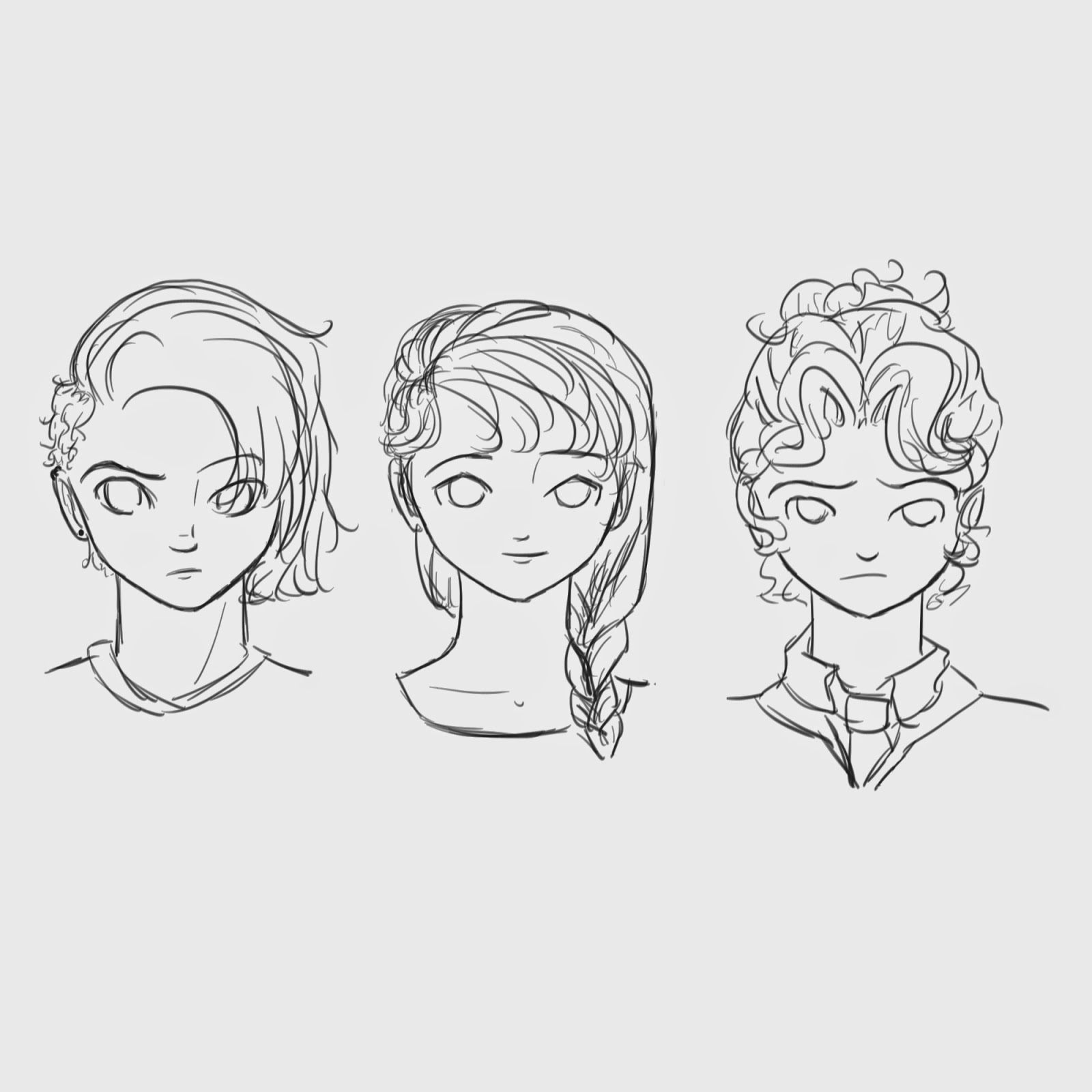
What is this? Three faces?
Yes. Lucky you gets three tutorials in one. I felt like further demonstrating how a hairstyle determines character, so I decided to draw three different examples.
Take your time with this step. If you're not confident in your blank-face drawing abilities, google a tutorial specifically on that. Or if you really, really want to, you can use the one I did last year on the subject.
Once you've got your basic face, and some rough guidelines to place your features later on, you can move on to the next step.
Here is the first part of determining character. There are all sorts of different hairlines and parts. They can be straighter, pointed, even... Have fun with it! Put the part wherever you want. (Poppy's part is straight down the center, so it kind of merges with the guidelines.)
Annie's part has a line going perpendicular to the rest of it, because her hair will eventually be in a braid. The hair that's not a part of her bangs goes straight back, although it will still slightly follow the part line.
This step looks a little messy, because there are a lot of lines on a small drawing. Go ahead and zoom in a bit to get a better idea of where they're all coming from.
Basically, start at the part or hairlines, and start adding the hair in. Now is the time to choose whether the hair is straight, curly, or wavy; pick the one that shows your character's personality best. The bang style will also show personality.
(See how this is all coming together already? Rachael is obviously a more spunky, walk-to-my-own-beat person, Annie looks prim and proper, and Poppy just looks like she ran her fingers through her hair and called it a day.)
Now you get to decide where the rest of the hair is going. Is it long, short, or somewhere in the middle? Does she prefer it loose, or thrown back into a ponytail, or does she spend a lot of time putting it into some elaborate hairstyle? Or maybe she has someone to do it for her...
(If you have a royal character, this is the time to really have fun with the hairstyle. Delicate braids, curls and beads, and anything else that strikes your fancy!)
This step actually isn't hairstyle related. Just add character-specific details, facial features, and some clothing on the shoulders. (I won't go off on another spiel on clothing being equally important for defining character... Hopefully you already know that.)
I was also getting severely irritated by the fact that the faces were lopsided, so I cleaned that up in this picture as well.
Dark the lines you want to keep, and erase the rest. Or if you're drawing digitally, like I was, make a new layer and go over all the good lines. Delete the other layers, and voila! You have a finished drawing.
I'm not done coloring them yet, otherwise I'd post that as well. Maybe I'll save it for a coloring tutorial sometime...
Any questions? Comments? I'd love to hear from you! And I'd also love to see your art. Post a link to your blog in the comments, or if you'd rather, email me the picture at windowtothesoulcontests[at]gmail.com. I love seeing what you guys come up with! :)
We have an art contest open for submissions, see the guidelines here.
Yes, you get to deal with my art skills again today. I haven't posted a tutorial in a good long while, so I figured I might as well put one together for you guys.
I will warn you ahead of time. My style has changed a bit since the last time I posted a tutorial, and I'm not sure if it qualifies as manga anymore. It's mostly just Catsi-style now.
On to today's topic: Hairstyles.
Or, to be more specific, Hairstyles that Define Character. "Character" being personality, in this instance. Something I tend to do when designing a character is just throw on the first hairstyle that comes to mind. While this does work sometimes, most of the time putting a bit of thought into how your character's hair looks will help whoever is looking at the drawing later know what personality that character has--just from a headshot!
Obviously, facial expression, pose, etc., are also helpful in conveying expression. But don't underestimate the power of a hairstyle.
(On a drawing. Forget hairstyles in real life--I'm too
![]() |
| Step One - A face. Or three. |
Yes. Lucky you gets three tutorials in one. I felt like further demonstrating how a hairstyle determines character, so I decided to draw three different examples.
Take your time with this step. If you're not confident in your blank-face drawing abilities, google a tutorial specifically on that. Or if you really, really want to, you can use the one I did last year on the subject.
Once you've got your basic face, and some rough guidelines to place your features later on, you can move on to the next step.
![]() |
| Step Two - Hairline. |
Here is the first part of determining character. There are all sorts of different hairlines and parts. They can be straighter, pointed, even... Have fun with it! Put the part wherever you want. (Poppy's part is straight down the center, so it kind of merges with the guidelines.)
Annie's part has a line going perpendicular to the rest of it, because her hair will eventually be in a braid. The hair that's not a part of her bangs goes straight back, although it will still slightly follow the part line.
![]() |
| Step Three - Add front part of hair. |
This step looks a little messy, because there are a lot of lines on a small drawing. Go ahead and zoom in a bit to get a better idea of where they're all coming from.
Basically, start at the part or hairlines, and start adding the hair in. Now is the time to choose whether the hair is straight, curly, or wavy; pick the one that shows your character's personality best. The bang style will also show personality.
(See how this is all coming together already? Rachael is obviously a more spunky, walk-to-my-own-beat person, Annie looks prim and proper, and Poppy just looks like she ran her fingers through her hair and called it a day.)
| Step Four - Add the rest of the hair. I also gave them necks, because floating heads look really creepy at this point. |
Now you get to decide where the rest of the hair is going. Is it long, short, or somewhere in the middle? Does she prefer it loose, or thrown back into a ponytail, or does she spend a lot of time putting it into some elaborate hairstyle? Or maybe she has someone to do it for her...
(If you have a royal character, this is the time to really have fun with the hairstyle. Delicate braids, curls and beads, and anything else that strikes your fancy!)
| Step Five - Add details. |
I was also getting severely irritated by the fact that the faces were lopsided, so I cleaned that up in this picture as well.
![]() |
| Step Six - Clean up the lines and ink! |
I'm not done coloring them yet, otherwise I'd post that as well. Maybe I'll save it for a coloring tutorial sometime...
Any questions? Comments? I'd love to hear from you! And I'd also love to see your art. Post a link to your blog in the comments, or if you'd rather, email me the picture at windowtothesoulcontests[at]gmail.com. I love seeing what you guys come up with! :)
We have an art contest open for submissions, see the guidelines here.
Saturday, May 24, 2014
How to Key a Background in Photoshop
Post by Elisabeth TenBrink Kelley, co-founder
Something often used in film is "keying" a color. This is what they do with green screen. They make the background one color, and then key that color, and remove it, leaving it clear, which allows them to insert something else. Now, it can also be useful to photographers and graphic designers, as it was to me just yesterday, so I'll explain how to do it. Now, I use CS5, but certain earlier versions do work, and later ones certainly do, but I'm not certain which ones.
So, the first thing is to have a picture with a distinct background. It doesn't have to be perfectly one color, but the closer the better. Here's my example:
Seeing as this is a computer-made image, the background is very distinct, but with photos it will likely not be, so try to fix that as much as you can. Before we can move on, you need to make use that your primary color is the same as the background, so get the "eyedropper" tool and click your background. It looks like this:
Next, we go to "Select" in the tool bar and click "Color Range", which is highlighted in blue below.
Once you do, you will see a window like the one below, which will show you what is selected. (The white is selected, not the black) Adjust the "Fuzziness" until it covers the background well, but not the subject. You can also choose other preview options, which change the appearance of your image, not the black and white preview in the window.
Once everything you want to get rid of is selected, press "OK" and you will be left with this:
However, before you can remove the background, you need to make sure that your layer isn't locked. Background images are by default locked, and if you only have one layer, then it is automatically a background. It see if your layer is locked, look for the little padlock next to it.
If it has one, just click and drag it to the little garbage can at the bottom of the "Layers" window. With that done, make sure everything you need is selected, and press "Delete".
You should be left with something like this; a clean image ready to receive a new background. There are other ways of removing backgrounds, but this is the quickest and simplest, as long as you don't have anything of the background's color in the subject. If you do, the "Lasso" tool would probably work better.
Elisabeth TenBrink Kelley is an aspiring author and poet who likes to tinker with things in Photoshop. You can learn more about her in our About Us page.
Something often used in film is "keying" a color. This is what they do with green screen. They make the background one color, and then key that color, and remove it, leaving it clear, which allows them to insert something else. Now, it can also be useful to photographers and graphic designers, as it was to me just yesterday, so I'll explain how to do it. Now, I use CS5, but certain earlier versions do work, and later ones certainly do, but I'm not certain which ones.
So, the first thing is to have a picture with a distinct background. It doesn't have to be perfectly one color, but the closer the better. Here's my example:
Seeing as this is a computer-made image, the background is very distinct, but with photos it will likely not be, so try to fix that as much as you can. Before we can move on, you need to make use that your primary color is the same as the background, so get the "eyedropper" tool and click your background. It looks like this:
Next, we go to "Select" in the tool bar and click "Color Range", which is highlighted in blue below.
Once you do, you will see a window like the one below, which will show you what is selected. (The white is selected, not the black) Adjust the "Fuzziness" until it covers the background well, but not the subject. You can also choose other preview options, which change the appearance of your image, not the black and white preview in the window.
Once everything you want to get rid of is selected, press "OK" and you will be left with this:
However, before you can remove the background, you need to make sure that your layer isn't locked. Background images are by default locked, and if you only have one layer, then it is automatically a background. It see if your layer is locked, look for the little padlock next to it.
If it has one, just click and drag it to the little garbage can at the bottom of the "Layers" window. With that done, make sure everything you need is selected, and press "Delete".
You should be left with something like this; a clean image ready to receive a new background. There are other ways of removing backgrounds, but this is the quickest and simplest, as long as you don't have anything of the background's color in the subject. If you do, the "Lasso" tool would probably work better.
Elisabeth TenBrink Kelley is an aspiring author and poet who likes to tinker with things in Photoshop. You can learn more about her in our About Us page.
Labels:
art,
art tutorial,
article,
educational,
founder post,
Photoshop,
post,
tutorial
Saturday, May 10, 2014
How to draw a female manga body
Hey everybody, Catsi here. Again. I'm doing another art post (yay!), this time on drawing body proportions.
I won't spend forever rambling about art before we get into the tutorial this time. All I have to say is that this is just my way of drawing bodies. There are tons of other ways--just google it. Try different styles, and find out what works for you.
So here we go.
Step one: Draw the head.
If you missed my last tutorial on drawing faces, here's a link: http://windowtothesoulcontests.blogspot.com/2014/03/how-draw-manga-face.html
Step two: Add circles for the body.
A smaller one for the upper torso, and a larger one for the hips.
Step three: Circles for legs and arms.
I only drew one circle for each arm, since the pose I'm drawing will have the character with her hands behind her back.
Not a step: Proportions
I just drew a few brackets to give you an idea of how everything is proportioned, using the head as a comparison. Each bracket is one head long.
Step four: Out line the torso and arms.
Take your time, and make sure that everything looks like the way it should be.
Step five: Outline the legs.
Again, take your time. Try to make the legs look symmetrical.
Step six: Feet.
I have the toes pointing toward each other in this picture, but feel free to experiment and do them however you like.
Step seven: Add clothing.
This may look like a complicated step, but it's not too hard. Just have fun and draw her clothes in your favorite style. A few wrinkles here and there will add a bit of realism to the drawing.
Step eight: Outline the hair.
I've chosen to give my character sideswept bangs and a single braid over her shoulder. It's just the rough outline at this point--I'll make it more detailed later on.
Bonus tutorial: Braids, step one
I erased all the lines under the braid, just so I can see to work.
Bonus tutorial: Braids, step two
Don't try to make the exact shapes that I have drawn--they're not supposed to be perfect. Just make a few heart-ish-diamond-ish shapes, getting smaller as you go down the braid. A little ponytail on the end finishes up the outline.
Bonus tutorial: Braids, step three
Add a few lines for the strand of hair every here and there, making sure they're going in the right direction for the braid. Voila! Done.
Step nine: Darken your lines.
Make sure not to darken the guidelines your drew early on--you want to be able to erase those in the next step.
Step eight: Erase guidelines.
If you drew your guidelines lightly enough, and your outlines dark enough, you'll be able to erase the guidelines easily and not have to stress over accidentally erasing a line that you want to keep. Even if you do erase one, it'll be dark enough that the mark will still be on the paper, and you can go back over it.
Step nine: Finishing touches!
Sign, date, and add extra lines in the hair and clothing. Ta-da! You're all done.
A few quick tips for you:
In this tutorial, I had my character's feet pointing toward each other. I think that makes her look cute, and conveys an air of innocence.
If you so choose, you can spread the legs farther apart, making your character seem more determined.
I've also got a nice little reference sheet of different poses for you. Move around an arm or leg by changing to location of a circle, and make an entirely new pose!
(I've left the guidelines unerased, so you can see the circles underneath the clothing.)
Well, I guess that's it. Hope you all had fun! If you have any questions, just post in the comments.
Also, I'd love to see how your drawing turned out! Feel free to email it to us, at windowtothesoulcontests[at]gmail.com, or if you posted it on your blog, drop us a link in the comments.
We have an art contest going on right now. You can view the guidelines here: http://windowtothesoulcontests.blogspot.com/2014/05/mother-art-contest.html
Labels:
art,
art tutorial,
article,
educational,
founder post,
manga,
post,
tutorial
Saturday, March 22, 2014
How to Draw a Manga Face
Post by Catsi Eceer, co-founder
Hey everybody, it's me again, Catsi. Instead of boring you all to death with ramblings on writing, this time I'm going to bore you all to death with ramblings on art! How exciting!
All right, I'm actually not going to be doing a whole lot of rambling. Most of the post will be done in pictures, so you don't even have to look at the words (although I'll be adding extra tips after each picture, so you may want to pay attention).
This is lesson is on drawing a manga face. Faces are actually really hard, and they were something I struggled with for a long time. But now I've figured out how to use guidelines to make sure you have everything proportioned properly, and my faces usually turn out quite nicely.
There are several ways to draw manga faces. Just google "how to draw manga faces" and you'll get a gazillion different tutorials on different ways to draw them. This is my preferred approach, with guidelines that work for me. After you've completed the tutorial, try changing things to make it just right for you.
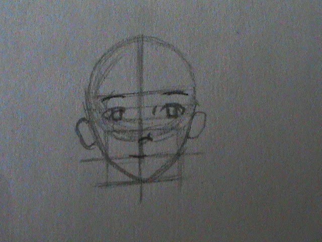
Step one: Draw a circle.
Simple enough. Circles aren't too tricky, but if you're struggling to get it right, you can try using a stencil. (Even just trace a lid... I've done that before.)
Step two: Divide the circle into four parts.
A straight line down, and a straight line across. Try to get these as even as possible. (You can see that I'm not so great at drawing straight lines...)
Step three: Divide the lower half into four more parts.
This may look complicated, but all you have to do is draw a line dividing the lower half of the circle in half, and then each of those parts in half again (a total of three new lines).
Step four: Bring the center line down farther and draw another horizontal line.
Oh no, not more straight lines! The distance between the lower horizontal line and the bottom of the circle is equal to three of the subsections you made in step three.
Step five: Draw two more vertical lines.
The two new lines go from the edges of the last subsection line in the circle to the lower horizontal line. If your center horizontal line is exactly in the middle, the two section created in this step should be even.
Step six: One more straight line.
This line should be halfway down the lines drawn in the last step, but not the center line. Great job, you've finished the guidelines, or the "skull," as my sister likes to call it. Now we'll actually start drawing the face.
Step seven: Begin drawing the chin.
Draw two diagonal lines, each starting in the third-from-bottom subsection and going down the intersection of the mid-lower horizontal line and the side vertical lines.
Step eight: Finish the chin.
Draw two more diagonal lines to connect the lines you drew in the last step at the intersection of the lower horizontal line and the center vertical line.
Step nine: Guidelines for the eyes.
Just continue the side vertical lines up to the third subsection lines. These will help you place the eyes in the next step.
Step ten: Draw the upper eyelids.
The distance between the lines should be equal to one of the lines. (You can make the eyelids a little more even then I did... I'm horrible at drawing even eyes.)
Step eleven: Draw the irises.
Draw two rather irregular rectangles for the irises. I also added the corner of the eyes in this step, however depending on what your character's eyes look like, you may want to draw them differently.
Step twelve: Draw the nose.
Oh, noes! Manga noses are so easy to draw. Just a little line at the intersection of the center vertical line and the bottom of the circle.
Step thirteen: Add the ears.
Step thirteen--The part I am really horrible at. (I'm not normally superstitious... but really?) I drew the ears a little too small here, so feel free to make them larger. The top of the ear should be about level with halfway through the eyes.
Step fourteen: Eyebrows.
I usually draw the eyebrows before the mouth, because I think the eyebrows add more expression than the mouth does. I never really know what expression I'm going to draw until I draw the eyebrows. These are rather neutral eyebrows, so I'm going to go with the default manga expression: cheerful.
Step fifteen: Draw the mouth.
To complete the cheerful look, just add a gently curving smile.
Step sixteen: Add details.
Add detail to the inside of the ears, and the eyes.
Step seventeen: Erase the guidelines.
If you're going to be inking your drawing, you can skip this step. I really dislike inking, for some reason (probably because I'm horrible at it), so I'm just going to stick with a pencil sketch for this one. I erase the guidelines now because it's really tricky to erase them without erasing hair.
Step eighteen: Add a neck and shoulders.
Because you don't want your head just floating on the paper. Make sure the neck looks strong enough to support the head!
Step nineteen: Draw outlines for the hair.
We're almost finished, I promise. The character I'm drawing has straight bangs and very curly hair (although you can't tell that now) but feel free to use any hairstyle that strikes your fancy.
Step twenty: Add more details to the hair.
Unless you're actually drawing the character that I am, you can skip this step. I'm just sketching in where the curls are going to fall.
Step twenty-one: More details.
Now I'm actually filling in the curls, and I've given her a headband.
(Zoom in on the curls)
Here you can see that the curls are just a bunch of lopsided rectangles stacked on each other. This produces a very tight curl. If you want something looser, make the rectangles softer and larger.
Step twenty-two: More details.
I've just added a few lines in each of the curl rectangles to make it a bit more realistic.
(Zoom in on curls)
Yep. Just a bunch of lines in the rectangles.
Step twenty-three: Draw some more details.
I've filled in her eyes except for the irises and the highlight, as well as her headband. I also added some clothing details that are specific to this character, and detail of her collarbone.
Step twenty-four: Shade, sign and date!
I didn't actually do much shading with this one. It's a lot simpler than what I normally draw, however if you want to shade, go ahead and do it. Just figure out where your light source is and darken accordingly. Sign your name at the bottom, date it, and voila! you have completed a manga face.
How did yours turn out? Any questions I can clear up for you?
To learn more about Catsi, see the About Us page.
We have one ongoing haiku contest. See the guidelines here.
Labels:
art,
art tutorial,
article,
educational,
founder post,
manga,
post,
tutorial
Subscribe to:
Posts (Atom)